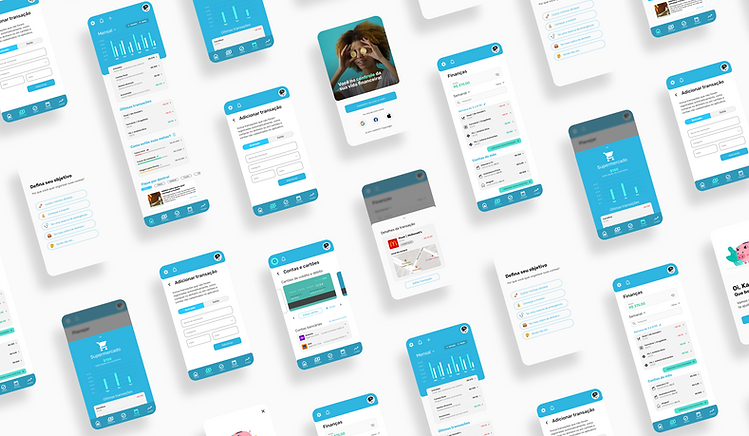
App Course Project Ca$h On
Project: Final project for UX specialization
When: 2021
My role:
I was responsible for the entire research phase (both qualitative and quantitative), benchmarking, prioritization exercises, and the creation of personas and user journeys. I also designed the app’s wireframes and user flows, conducted usability tests, developed the style guide, created high-fidelity prototypes, and helped define success metrics for the project.
the challenge
To help people prevent and treat undebtness with financial education and monthly finances management
Between september and december of 2021, I worked with three other designers in this project, discovery to delivery. We accepted the following challenge: To help people having responsible consuming habits, to prevent and treat indebtedness as a form of social inclusion, keeping in mind brazilian context: over 60 million people are in debt and now we're facing the rising of Open Banking
PROJECTS AND RESULTS
discovery
We conducted market research to understand the financial reality of Brazilians. Then, we used a CSD matrix to map out the current scenario, as well as the doubts and assumptions that needed to be validated. To define priorities in the discovery phase, we ran an Impact vs. Knowledge matrix exercise.
Based on that, I created an initial survey to identify our product’s potential audience. With the collected data, we reached out to some of the respondents for in-depth interviews, aiming to better understand their financial habits and daily experiences.
personas and journey
With the research results in hand, we had a much clearer understanding of our target audience, which allowed us to move forward with persona development. I identified two predominant user profiles from the survey responses and defined their financial habits, goals, pain points, and potential solutions. Based on these personas, I mapped out each user’s current journey (without the product) and the ideal journey with our proposed solution. This process helped us build more effective user flows and define features that addressed real problems already identified in the research.
feature prioritization
At this stage, we conducted a group workshop using the Impact vs. Effort matrix. The goal was to define which features would be included in our app and how they would be delivered to users — in other words, identifying the essential screens and the best way to structure the user flows to access them effectively.
wireframes ans tests
Based on the research findings and team alignments, I moved on to creating low-fidelity wireframes. The goal was to map out the ideal user flow within the app and define which information was most relevant on each screen. Together with another team member, we decided which services should be prioritized and used that to build the initial structure of the app. In the end, we conducted our first usability test to validate both the flows and core functionalities.
styleguide
With the brand identity and key concepts we wanted to convey — modernity, technology, finance, and simplicity — I defined the brand colors and designed the main components of the style guide, including colors, buttons, typography, images, icons, and more. I made extensive use of Auto Layout and Atomic Design principles, which allowed us to build screens with greater speed and consistency during the UI phase.
interactive prototypes
After defining the style guide and analyzing the results from our first usability test, I moved on to creating the high-fidelity prototypes. I made adjustments to improve some pain points in the user flow that were identified in the initial testing and built an interactive prototype. Once finalized, I created the project documentation, highlighting each screen’s flow and key information for the development team.
With the interactive prototype ready, I conducted a second usability test to validate the final version of the screens.
metrics
Once the UI design phase was completed, we defined the metrics we would use to evaluate the success of the solution. To do this, we planned to measure the product’s NPS (Net Promoter Score) and adapted the HEART framework to fit our project.
This allowed us to track:
-
Happiness and user satisfaction while using the product
-
Engagement, to see how users interacted with the app and whether key features were being used
-
Adoption, to understand how many users would start using our solution (linked to growth rate)
-
Retention, measuring whether users would remain active and continue using the app over time
-
Task success rate and time on task, to evaluate how efficiently users completed their goals

block & difficulties
Agenda management
All of us were working back then and had this project in parallel. Because of this, we had some problems with scheduled meetings and managing our time and tasks to be able to deliver the final project in three months. Besides all that, we could finish our project two weeks before our deadline.
Poor UX background
Even though some of us were already working with UX Design, others were still on the beginning of their career. So as a group, we didn't have a rich and solid UX background or decision making. The solution here wast to count on our mentors sometimes to help us with our design decisions.